
Responsive wordpress websiteS
In today's digital landscape, the dominance of mobile browsing is undeniable, with over 50% of website traffic originating from handheld devices. While desktop optimization remains crucial, the rise of mobile demands a responsive approach to web design—an approach tailored to deliver an unparalleled user experience across all screen sizes.
Enter WordPress—a powerhouse in web-based publishing and content management. Renowned for its versatility and user-friendly interface, WordPress stands as the go-to platform for dynamic website development.
Behold, two stellar examples of responsive WordPress websites meticulously crafted to meet the diverse needs of modern clientele:
Aktipak—an innovative acne treatment targeting the ever-active teen demographic. Recognizing the importance of accessibility on-the-go, Aktipak's website boasts a sleek, mobile-responsive design. Quick-loading and intuitively navigable, it ensures seamless browsing experiences for users across all devices.
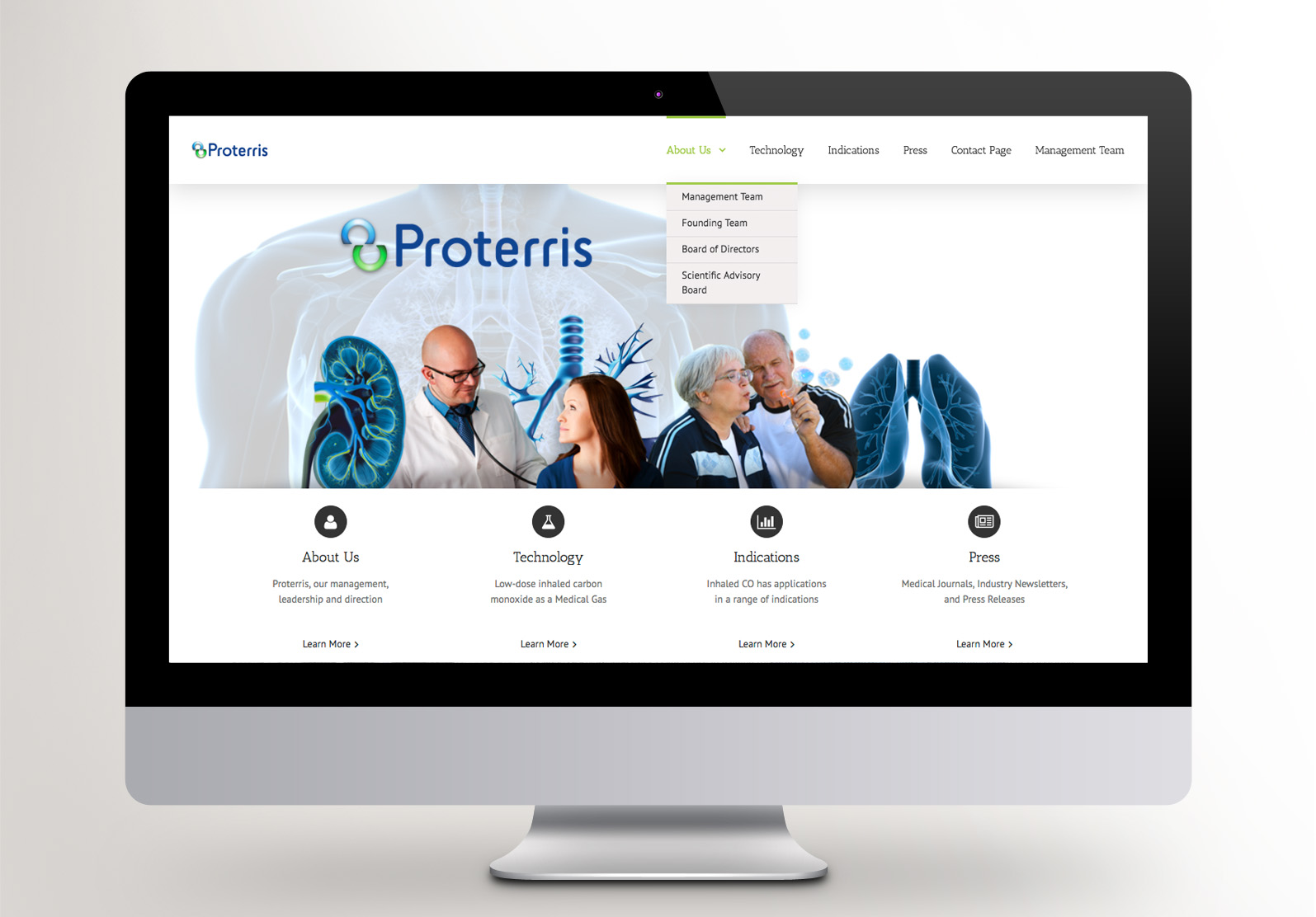
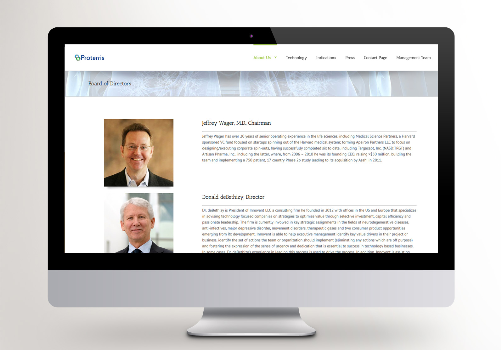
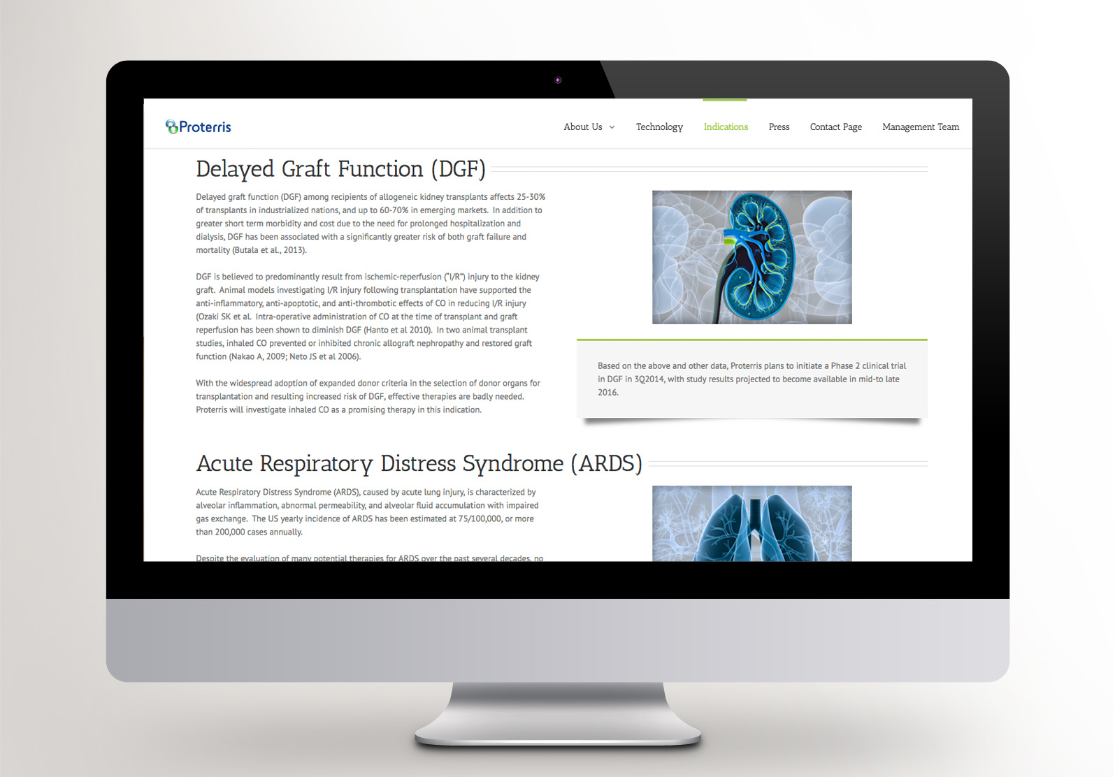
Proterris—a cutting-edge therapy in the pre-market stage of development. For Proterris, WordPress emerged as the perfect ally, offering unparalleled expandability for future web endeavors. Moreover, its intuitive interface empowers clients to effortlessly manage and update content, ensuring the website remains a dynamic hub of information and engagement.
With responsive design and WordPress prowess at the helm, these websites exemplify the fusion of innovation and accessibility, setting new standards in the digital sphere.